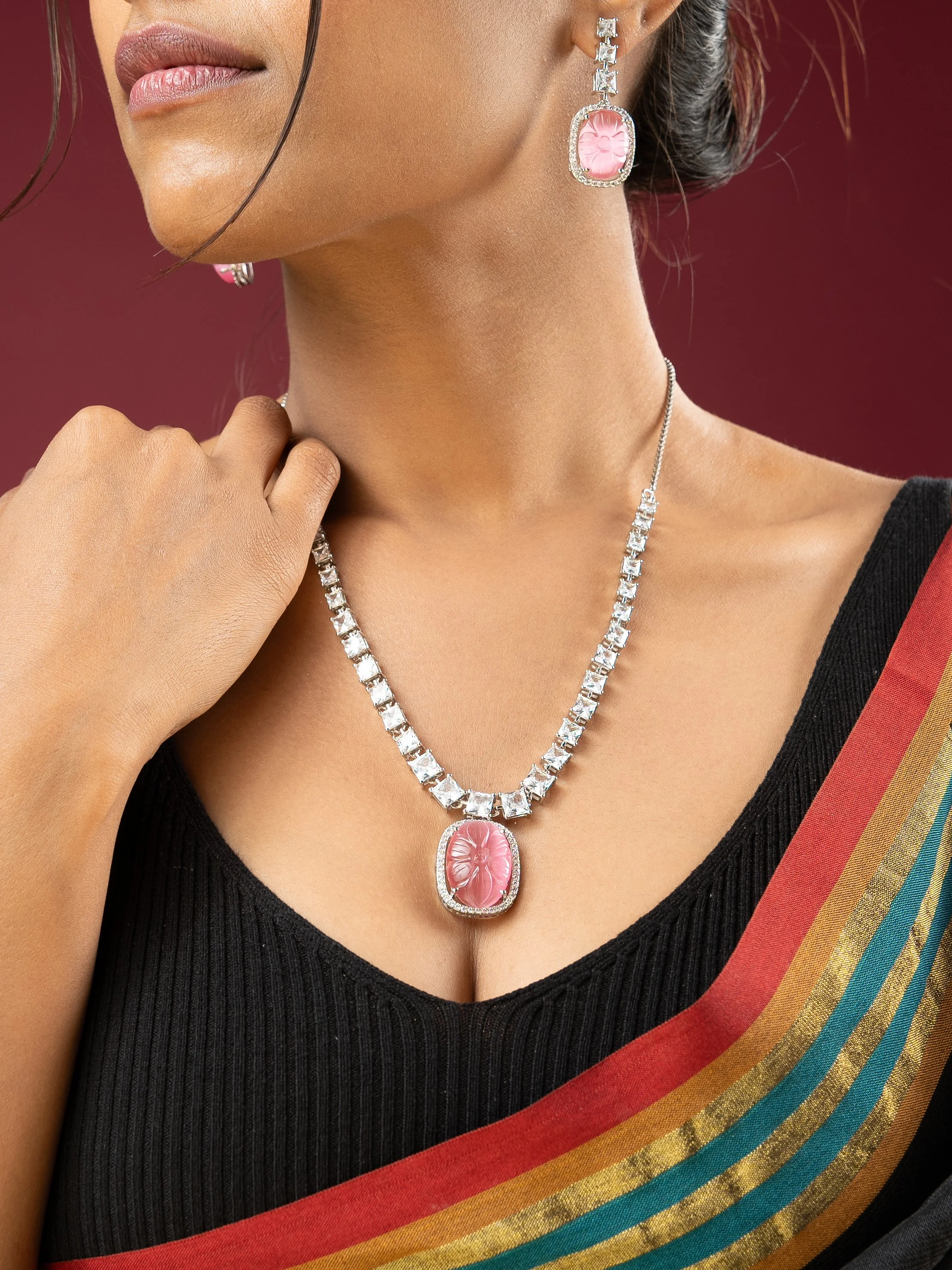
Every fine jewellery brief ends up asking the same question twice, because it needs two different answers. One: does this look like something worth wanting? Two: can a customer tell exactly what they're buying? For Viraasi, we shot both — a campaign pass and a product pass — on the same pieces, in the same session, and treated them as genuinely different jobs.
The campaign frames
A pink cabochon pendant with matching drops, worn over a black top and a striped saree, isn't really a photograph of a pendant — it's a photograph of a mood, with the pendant doing the work. The styling carries as much weight as the lighting here: dark, textured fabric gives the stone somewhere to sit without competing colour, and the saree's stripes add just enough movement that the frame doesn't read as static. This is the shot that makes someone stop scrolling. It is not the shot that shows them the clasp.
The product frames
That's what the packshots are for. A hammered gold multi-band cuff on a white pedestal, lit against a warm peach gradient, exists purely to answer "what am I actually getting." The gradient keeps the frame from feeling clinical — a flat white background photographs the metal accurately but reads as catalogue filler; a graded warm tone lets the gold stay honest while the frame still feels considered.
The precision pieces got the most careful treatment. A pendant set on black, with a line of square-cut white stones running down to an oval pink centre, needs every facet doing its job — the lighting has to separate stone from setting without a single blown highlight anywhere along that line, or the piece reads as flat in a customer's hand later when it doesn't match the photo. A necklace and earring set built from concentric stone-set circles, angled across matte black, relies on that same discipline: each ring of stones has to catch light independently, or the geometry that makes the design worth buying disappears into one bright blur.
Why both passes matter
Geometric gold triangle drop earrings, hung on a teal block against a tan backdrop, sit somewhere between the two — styled enough to have presence, precise enough to read as product. That's usually where the best single frame in a jewellery shoot ends up living, when there's time for only one image to do both jobs.
A campaign photo sells the feeling. A product photo sells the fact. Fine jewellery needs both, and neither one is optional.