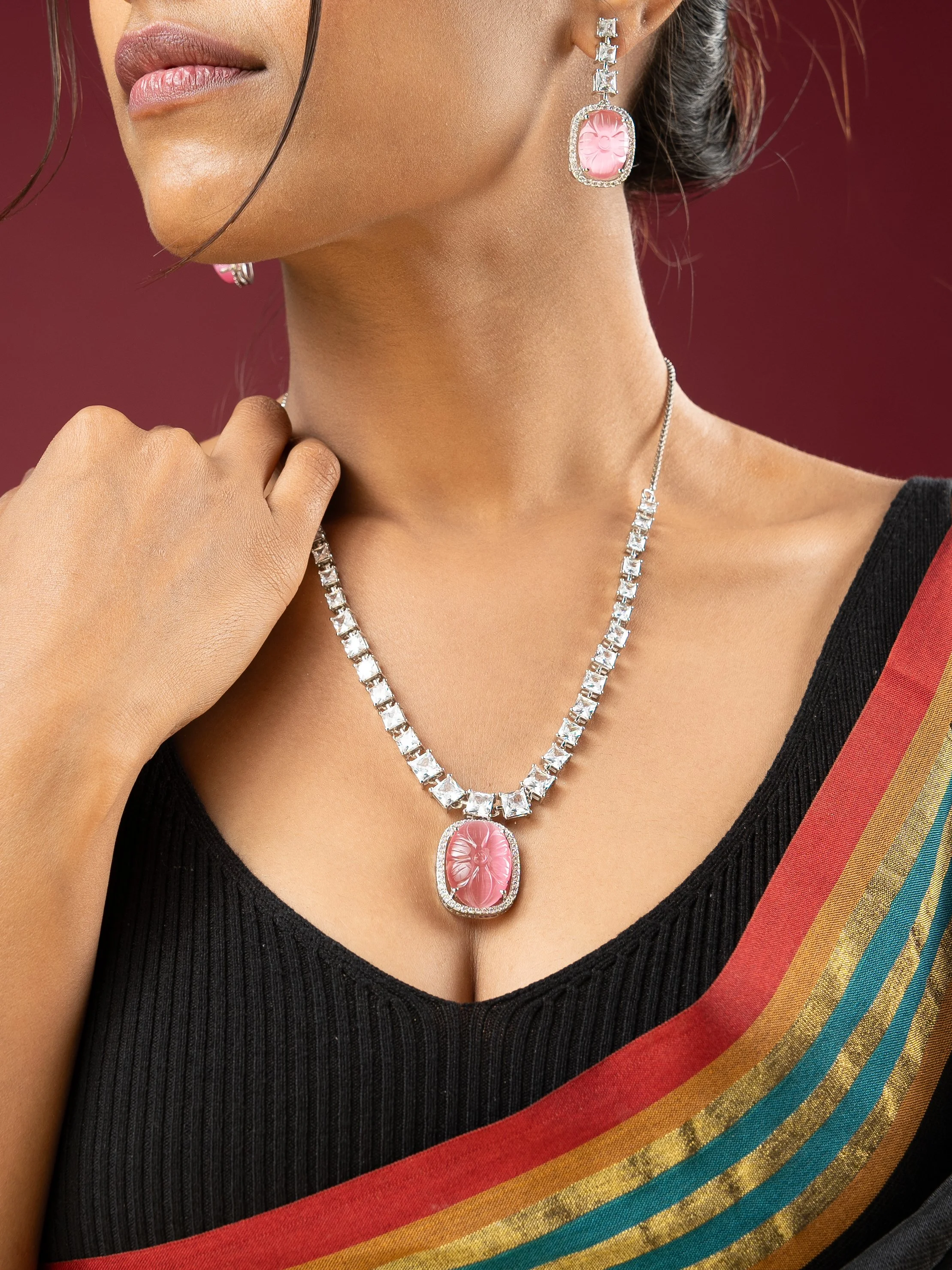
Jewellery punishes lazy lighting. Every stone is a mirror, every polished edge picks up whatever is in the room, and the difference between "expensive" and "cheap" on screen is almost entirely a lighting decision.
For Viraasi we shot the same pieces two ways, because the brand needed them to do two different jobs.
Two passes, two jobs
The campaign frames had to make somebody want the piece — on a person, in a mood, with the kind of soft falloff that flatters skin and metal at once. The packshots had to do the opposite: tell the truth. If a customer receives a pendant that looks duller than the listing, that is a return and a bad review.
Shooting these as one setup is where most catalogues go wrong. They end up with product shots that look like moody art, or campaign shots that look like inventory.
The campaign pass
- A large softbox feathered across the frame, so the highlight rolls rather than clips
- Negative fill on the shadow side to keep the metal from going flat
- Shot around f/9–f/10 so the whole piece stays sharp while the background falls away
The goal is a single dominant highlight that travels along the metal as the eye moves. One clean specular, not five competing ones.
The packshot pass
- Tight aperture, controlled reflections, no colour cast anywhere
- Every stone individually checked for a catchlight — a dead stone reads as glass
- White balance locked to the same reference across the whole set, so the collection looks consistent on a grid
The test we use: could the client hold the physical piece next to the screen and see the same object? If not, relight it.
What we would repeat
Shooting both passes in the same session, with the same white balance reference, is what made the set hang together. The campaign frames sell the feeling. The packshots keep the promise.
If you are briefing a jewellery shoot, budget for both. They are not the same photograph.